I edited Wikipedia!

This week’s play activity was a lot of fun.

I was a bit nervous, so it was reassuring to read that no, I probably couldn’t break Wikipedia (phew!), that my editing didn’t have to be perfect, and that Wikipedia was a work in progress.  I have a problem with things needing to be perfect, and if I think something needs to be perfect, I probably will not begin, because I will be so overwhelmed at the thought of having to achieve perfection.

Wikipedia has a lot of resources to help you edit Wikipedia.  I started off doing the Wikipedia tutorial, which takes you step-by-step through the process of editing or creating a Wikipedia page.

The Tutorial included useful videos  about how to cite and edit articles:

By Living Colour Filmproduktion, Hamburg, for Wikimedia Deutschland (Wikimedia Deutschland) [CC BY 3.0 (http://creativecommons.org/licenses/by/3.0)%5D, via Wikimedia Commons

The tutorial also included a Wikipedia Cheatsheet to use with Wiki markup shortcuts, and you can also create your own sandbox to play/practice in:

My sandbox

My sandbox

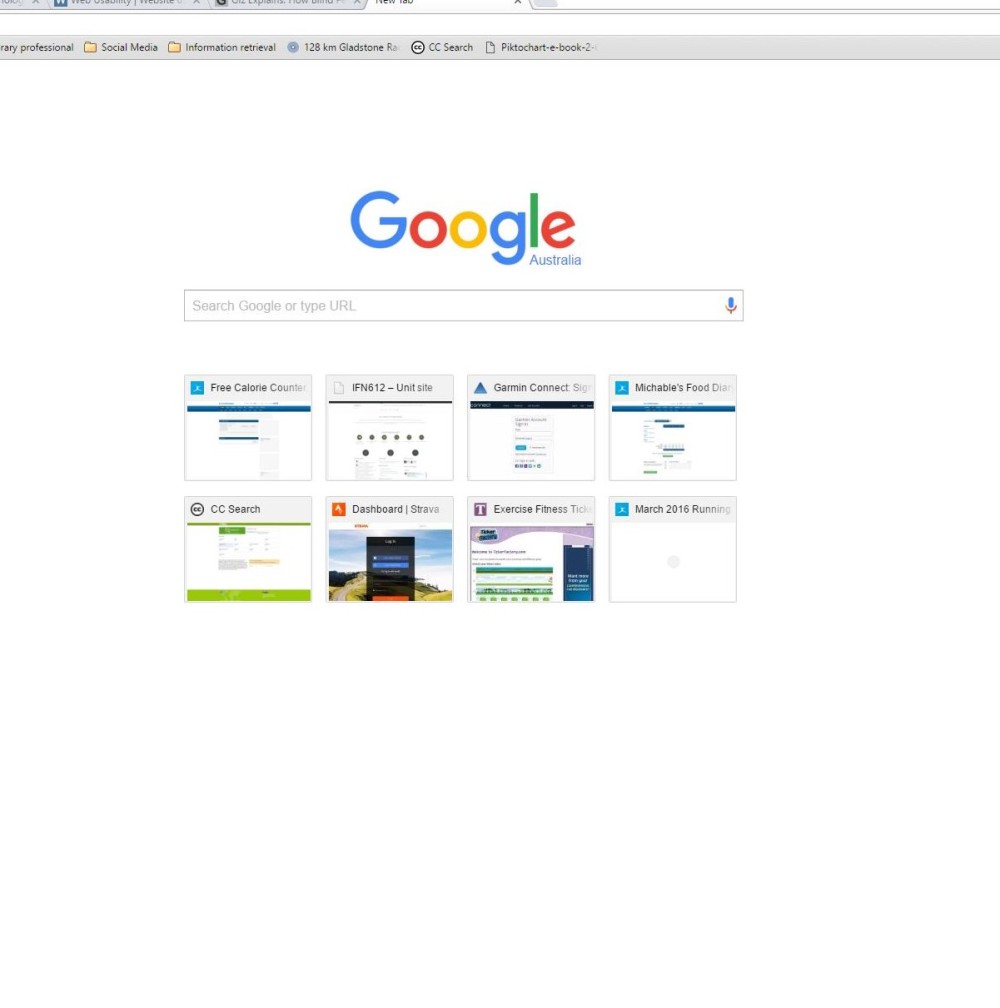
Armed with my tools, I thought I would begin by doing a “Citation Hunt”; a Wikipedia tool that randomly selects an article that needs a citation.  (Did you know that Wikipedia has over 302,603 articles that need citations?)

I thought this would be easy… it wasn’t.  I ran into a dilemma when I found information on the web that I thought I could cite for the Wikipedia article, but when I found there were no references cited on those webpages, I wondered if they had got their information from Wikipedia in the first place, and that perhaps this was not going to be a reliable, credible source.

I found that it was easier to search for a topic I knew about under its category (i.e. speech pathology), rather than try to complete a random citation.

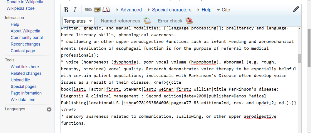
Here I hit pay-dirt, and edited the article, Speech-language pathology.  I added 8 references to this article.  Below are a few screenshots of the process:

Adding a reference / citation using templates:

You can choose from 4 templates to create citations. You can cite the web, news, a book or a journal.  I used the templates for citing the web, books, and journals, and they were easy to use. It took longer to find the references.

Adding a reference in Wikipedia

Adding a reference in Wikipedia

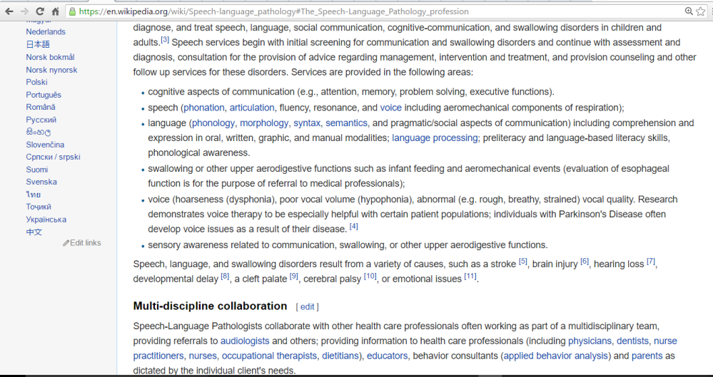
Article in editing / wiki mark-up mode:

Screenshot of one of the references I added in wiki mark-up.

Screenshot of one of the references I added in wiki mark-up.

Edit Summary:

This section asks you to describe the changes you made.

Screenshot describing changes made.

Screenshot describing changes made.

Show Changes:

When you select “show changes”, a screen displays the original text, and the changes you made side-by-side.

This shows the changes you made.

This shows the changes you made.

Show preview / Save page:

When you are finished, you can preview your changes to check that it will display correctly, before saving the page.

Screenshot showing the changes I made in the article body (I added citations 4-11)

Screenshot showing the changes I made in the article body (I added citations 4-11)

Screenshot of the references I added, after saving the page.

Screenshot of the references I added, after saving the page.

Future directions in editing Wikipedia:

This was a great activity.  I could see myself adding to this article to help improve it further.  Another of the issues identified with this article was that it may not represent a world-wide view of the subject.  At the moment, the article represents the profession from the perspective of the U.S.A.  I could add an Australian perspective, by writing about speech pathology education and training in Australia, and discussing speech pathology services in the Australian context.  Adding an Australian perspective would increase the relevance of the article to Australians, or those considering studying in Australia.

Playing with Infographics

I selected option 2: Data visualisation for this week’s play and reflect activities.

I had a vague idea in my mind that an infographic was simply a graphical representation of data like a bar graph or a pie chart, so I thought this task would be a piece of cake.  I didn’t understand that an infographic told a whole story of data.  I didn’t understand that this would be a time consuming and difficult task.  Nevertheless, with the optimism of the ignorant, I watched Kate Davis’ DIY Infographics video (which was very helpful), looked at some data from the Australian Bureau of Statistics’ National Health Survey 2014-2015, and began.

I was very impressed by the ABS summary video of the survey results, which includes animated data visualisations of a very high standard.  It’s a short video, and definitely worth clicking the link.  It clearly represented a summary of the findings obtained from the survey, and communicated it to me, the viewer, in a way I found very easy to understand.  Much easier than going through the Excel spreadsheets I downloaded from the website, which contained the survey data, and lovely statistical terms such as “relative standard error of proportion”.

I used Piktochart to make the very basic infographic below.  Kate Davis recommended Piktochart as one of the easiest Infographic Makers to use.  I would also like to give Canva a go, as it looked good, too.  Kate also recommended Infogr.am, Visme and easel.ly.

I found this activity really difficult at first, but was slowly getting the hang of it by the end.  There are some things I didn’t work out, but I was working on a windows 7 tablet with a touchscreen, a keyboard, and no mouse.  (I’m away from home tonight for work, in a tiny motel room, eating Smith’s chips for dinner, doing my homework and can’t believe I forgot my mouse! I miss being able to point and click!) I think this made operating some of the program’s functions a bit more difficult. (That’s what I was telling myself anyway).

I was very happy when I worked out how to do the graphs…in fact, I was very happy when I worked out how to do anything on the program!  Although my infographic is not perfect, I am happy with the result, because it represents several hours of hard work and frustration, and a learning process like that is always satisfying when you have a finished product at the end.

I think I would become a more competent user of the programs, and produce better looking infographics with more practice and familiarity with the tools, and a clearer purpose for visualising the data.  I did find it a bit difficult to choose the data to analyse.

This activity has definitely piqued my interest in using infographics to represent data.  My powerpoint presentations could be so much more interesting!

I would definitely use one of these programs in the future to create a poster or infographic…I only wish I had watched Kate’s video before I completed my persona poster!

National Health Survey Infographic: Weight and Exercise

National Health Survey Infographic: Weight and Exercise

So, yes, I think that infographics are definitely a wonderful way to visually represent a data story … as long as you have vision, and intact learning abilities.  A comment from Kathleen prompted me to think about accessibility of infographics on the internet for people with disabilities; particularly those who are blind /visually impaired, and those with learning disabilities.

There are a couple of things to address: access to a device (input), and access to the content of the webpage (output).

I found this website, Web Usability, that discusses how people with disabilities use assistive technologies to access computers / devices and the internet.  Most work has been done to improve accessibility for people with physical and visual impairments, but a lot of work is still required.

There are a lot of issues. Not only does the person need to be able to access the device with an input device (e.g. alternative keyboard, switch, head pointer, eye-tracking, voice recognition), but the website needs to be accessible, too, to output the information to the person with a disability in a way they can access it; e.g. through screen-reading software for someone who is blind / visually impaired.  A lot of work exists for website designers to think about how to make their website compatible with screen-reading software, and how to include alternative text for images / infographics, otherwise, your beautiful infographic is simply an empty space on the webpage.  This Gizmodo blog post discusses some of the issues of designing spoken websites.

I think that there is still a very long way to go to make the internet accessible for many people with intellectual disabilities.   Generally speaking, the internet is a very wordy and confusing place, which effectively excludes many people with intellectual disabilities, as they may have difficulties with literacy, language (especially abstract language), conceptual development, attention, memory and learning.   The task of understanding an infographic on a webpage may be conceptually too difficult for the person with an intellectual disability, particularly if it represents abstract concepts that are not meaningful for the person.

But see this Spectronics blog post for how iPads are being used with students with intellectual disabilities.  Touchscreens may help a person with an intellectual disability interact with computers / apps, because the person can directly touch what they see and  make the link between something happening on the screen as a result of that touch.  This article talks more about suitable apps to use, rather than assisting the person to access the internet, though.

I could see the possibility that web browsers could be modified / developed to have picture symbols representing favourite websites or search functions, that speak when touched to let the person know what they are, and then used in combination with a touch screen device to enhance internet access for people with intellectual disabilites….

Hang on a minute – doesn’t the Google search page already look like that if you are signed into Chrome?  See my screen shot below, that has all my most used websites right there, waiting for me to select them.  With a few more tweaks, something like this could really work for people with intellectual disabilities (and probably is being used as we speak – I can’t be the first person to have thought of this).  Maybe people with intellectual disabilities aren’t as far away from accessing the internet as I thought. 🙂

Google and the Google logo are registered trademarks of Google Inc., used with permission.

Google and the Google logo are registered trademarks of Google Inc., used with permission.

My Quantified Self on Garmin Connect

For this activity, I tracked my physical activity (running) for 3 days, from Tuesday 29/03/2016 – Thursday 31/03/2016.  (Actually, I have tracked my runs for about the last 5 years on Garmin Connect).

I used an application called Garmin Connect, a Garmin Forerunner 220 GPS watch and a heart rate monitor.

I have the Garmin Connect app on my android tablet, and my GPS watch “syncs” my running data to the app via bluetooth after my run.  This usually occurs automatically.  I can then view the data from my run on the app, or on the website.  The data uploaded includes a map of the run, average and maximum pace, distance, time, average and maximum heart rate, cadence, elevation, the temperature, and splits. The website has more functionality than the app; but this is often the case with apps.

The screen shots below are from the Garmin Connect website, and show the runs I did over the 3 days.

4:53 am, Tuesday 29 March 2016

4:53 am, Tuesday 29 March 2016

GC_Wed Mar 30_2016

5:47am Wednesday 30 March, 2016

GC_Thu Mar 31_2016

4:58 am, Thursday 31 March, 2016

The tool can also create reports of your activity for defined time periods including a week, a month or a year, as shown below:

Garmin Connect Distance Graph for week

Garmin Connect Distance Graph for week

You can also create goals for yourself, and a visual representation is added to your dashboard so you can see how you’re going.

Garmin Connect Goals

Garmin Connect Goals

There is more: e.g. The app will keep track of how far you have run in your current shoes; there is a connections (social networking) feature so you can see how your friends are going; you can follow training plans, create workouts, create courses, update your device, track your weight, sync your workouts straight to My Fitness Pal.

There is a lot there to keep me endlessly fascinated by my own data 🙂

My favourite niche social media site

My Fitness Pal (MFP) is an uncommon social media site I use.  I don’t know whether it is uncommon, or what you might call “niche” or “special interest”.  A lot of people use it – 80 million, according to  Wikipedia.  But I guess when you compare it to Facebook, which has apparently 1.59 billion users, according to The Statistics Portal; 80 million is not that big a deal.  I have been using this site, off and on, since 2013.  There is an app as well, but I prefer the website. MFP is a tool to help you track your food and exercise to help you achieve health and fitness goals, mainly around losing, gaining or maintaining your weight.  So, I use MFP to track my food intake at times, mostly when I’m trying to drop a couple of kgs for an upcoming race.  I always log my exercise (well, another fitness app I use, Garmin Connect, logs it for me, because I have it synced to MFP).  This is my Garmin Connect dashboard, below:

GC

Now, bear with me; when I get home from my run, my GPS watch sends my run data by bluetooth to the Garmin Connect app on my tablet, which then sends my run data to MFP, where it posts to my exercise diary and my “news feed”. Got that?

Back to MFP.  There is also a social side to MFP.  I have a community of “friends” there that I have accumulated over the last couple of years; people with whom I share similar interests – runners mostly.  I have not met any of these people in real life, but we are all there to improve our health and fitness, and achieve personal goals.  It is a very supportive community.  It gives me somewhere to talk about, and get advice about, running stuff; e.g. what headlamp should I buy for early morning runs; what hydration belt should I use for long runs; what should my nutrition be like on long runs, etc.  As you can see from my profile pic (below) I identify as a runner on MFP.

MFP

I will impart a word of warning about the main forums on MFP, though.  There are a lot of diverse opinions about anything and everything diet and fitness related, some well-informed, others less so.  You will see debates around diet topics such as low carb, keto, paleo, clean eating, intermittent fasting, shakes, detoxes, weight loss drugs, starvation mode, and more; and debate around exercise topics too; e.g. strength training vs cardio, quality vs quantity in running training, can you gain muscle while in a calorie deficit, to name a few.  Like anything you read on the internet, you need to do your own research to determine the credibility of the information.  I did learn a lot on the forums, and reading posts there gave me the concepts and key words to do my own searches.

I like MFP. I like that it has a purpose, and it is useful. That appeals to me.

Do androids dream of Electric Sheep? or What would you do if you found out your boss was a robot?

Gartner prediction_4

Gartner Prediction No. 4

Dog Android_Boss robot

Android dog and Roboboss

I think we have all seen and read enough science fiction movies and novels about the dangers of robots and androids to have mixed feelings about the “rise of the robots”.

Think:

  • Alien
  • 2001 A Space Odyssey
  • Bladerunner (and the P.K. Dick novel it was based on “Do androids dream of Electric Sheep”)
  • The Terminator franchise
  • The recent ABC series “Humans”
  • The 2015 movie “Ex-Machina”

Science fiction loves to explore/exploit the issues surrounding android / human relationships; how humans are weak because our emotions allow us to get attached to androids, (It’s probably not a great idea that movies and novels make androids look so much like us that we forget they are not human); and the fear that androids can’t reciprocate our attachment, because they are… well… robots, and robots can’t feel human emotions is exploited for all it is worth.  So the androids kill us all, or enslave us, or just leave us to perish because ultimately, we are inferior to them in every way.

Before we let loose androids on humanity, we need to make sure Asimov’s Laws of Robotics are rock solid:

0. A robot may not harm humanity, or, by inaction, allow humanity to come to harm.

  1. A robot may not injure a human being or, through inaction, allow a human being to come to harm.
  2. A robot must obey the orders given it by human beings except where such orders would conflict with the First Law.
  3. A robot must protect its own existence as long as such protection does not conflict with the First or Second Laws. “Three Laws of Robotics”, 2016

And the thing is, having a roboboss seems to break the second law.  I thought robots were here to serve us?

Think:

  • Robovac.

Three Laws of Robotics. 2016. In Wikipedia. Retrieved March 6, 2016,  from https://en.wikipedia.org/wiki/Three_Laws_of_Robotics